Sometimes, less is more.
Although not as fun to look at as creative resumes, minimalistic resume templates have their own charm - and can be equally beneficial for your job hunt.
For starters, they’re simple to follow & understand.
In addition, more conservative industries (banking, law, finance, for example) prefer less flashy templates.
So, want to use a minimalistic template to compile a compelling resume & land the job?
Read on to find 11+ of our favorite free templates!
#1. Basic Resume Template

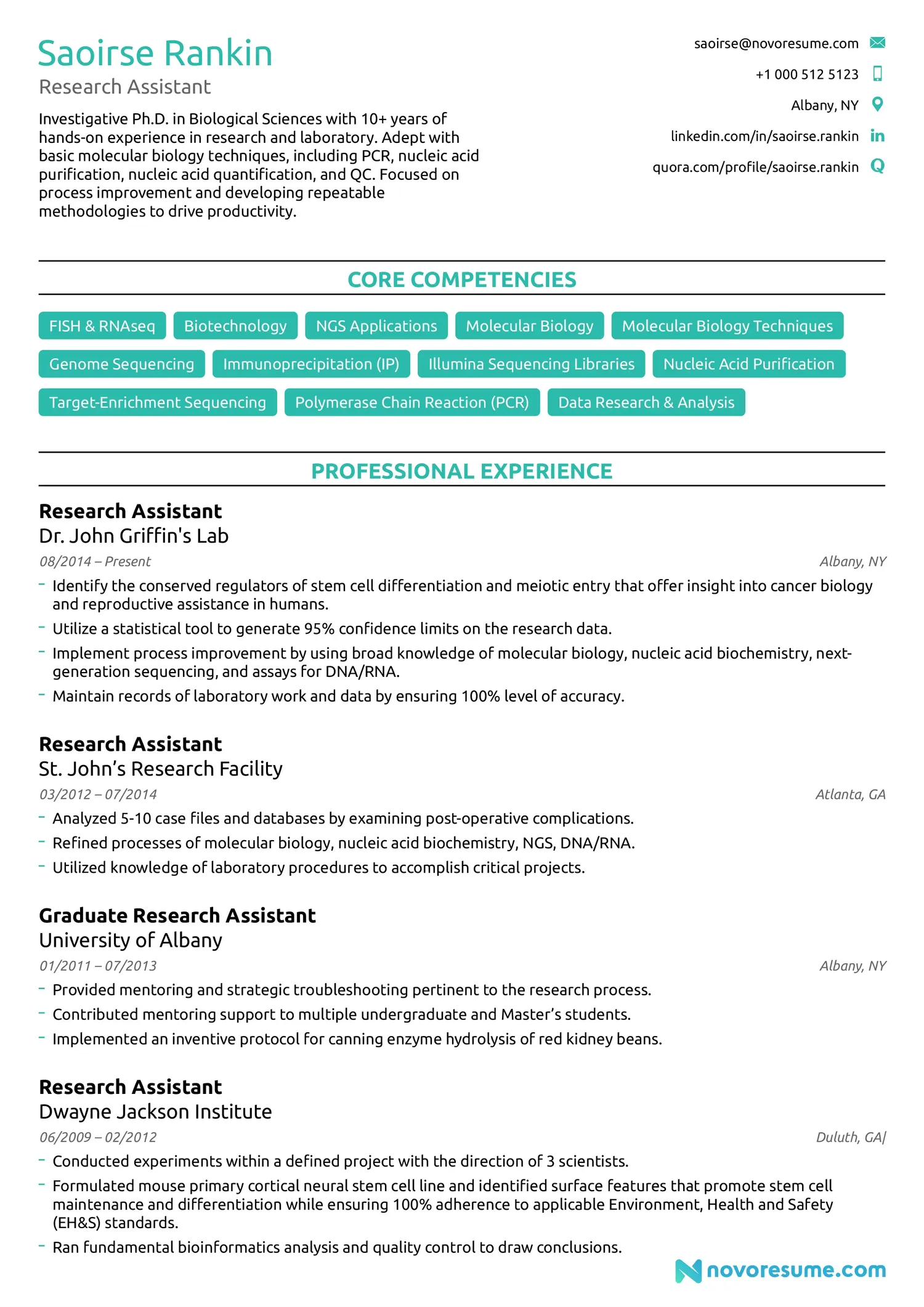
This minimalistic resume template is like the starter avatar of a game: no extras, no colors; just the basics - in a good way.
Its straightforward style gives equal importance to all of your resume’s sections, with particular emphasis on skills and work experience.
It’s an overall great minimalistic resume template that fits just about everyone.
#2. College Resume Template

As the name hints, the College minimalistic resume template targets a more specific audience.
While maintaining a clean & fresh look, this template puts the skills, education, and extracurriculars sections of a resume into the spotlight.
This makes it perfect for applicants with no work experience, like college students or career changers.
#3. Professional Resume Template

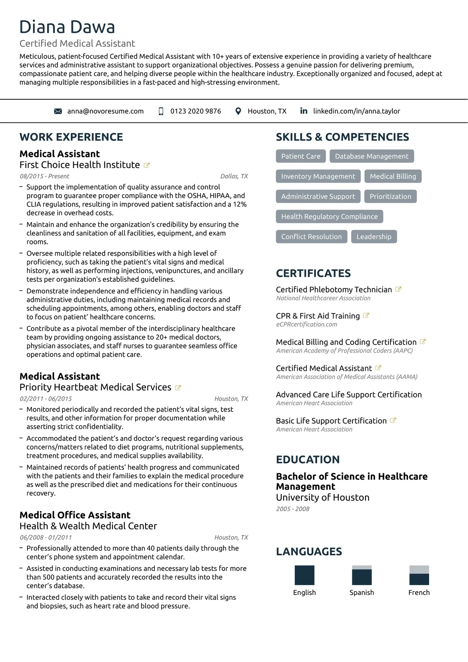
This is one of our most used minimalistic resume templates - and justifiably so.
The sections are organized in columns and some minimalist infographics are used to illustrate languages and skills.
The template is perfect for beginner to senior-level professionals, but not only. By simply changing or rearranging the resume sections, it can work for any applicant.
#4. Modern Resume Template

The Modern template features some extra elements, but still definitely falls under the minimalist category.
The faded geometric designs in the background and the brackets around work experience entries make the resume subtly stand out.
#5. Simple Resume Template

The Simple template is timeless and a perfect fit for the more conservative industries like banking or law.
But fear not - It’s a safe choice for all industries and types of applicants out there as well; with the exception of creativity-oriented industries like design, that is.
#6. Creative Resume Template

Doing a 180 from the previous template, the Creative resume template is a little more… well, creative.
It has a bold header section and place for a photo, which, by the way, you should think well about whether to include or not.
The template stands out through its bright accent color as well as its overall modern look.
#7. Functional Resume Template

Typically, the functional resume format is used by applicants with no work experience.
Following that format, recent graduates and career changers OR just about anyone can use the Functional template! All it takes is switching up the sections.
#8. Executive Resume Template

The Executive template resembles the Basic template but features some extras.
#9. Strong Initials Resume Template

This template is as clean and uncluttered as they come. Plain text on a white background, no lines, colors, or design extras of any sort. Nothing to focus on but the text. To add a little bit of playfulness, the initials of the applicant are placed in a large font at the top corner of the resume, almost resembling a logo. You can find the template here.
#10. Timeline Resume Template

Discover More Resume Templates
- Chronological Resume Templates
- Combination Resume Templates
- Creative Resume Templates
- Functional Resume Templates
- Google Docs Resume Templates
- High School Resume Templates
- Minimalistic Resume Templates
- One Page Resume Templates
- 2 Page Resume Templates
- Word Resume TemplatesThis minimalist resume template stands out from the rest by putting a “roadmap” in between your experience and education entries.
The design is quite modern and easy on the eyes and can work well for any applicant.
How & When to Use Minimalistic Resume Templates
It’s a no-brainer that a resume should stand out as much as possible, especially taking into consideration the fact that the average recruiter evaluates a CV for about 7 seconds.
That’s where creative resumes come in handy. Colors and illustrations are ought to grab the recruiter’s attention, right?
Well… while they will definitely grab attention, not all industries are as accepting towards colors and fancy designs.
Creative resumes serve as a kind of demonstration of your creativity, so they are great for jobs in graphic design, arts, or even when applying at a startup.
For jobs in banking, law, or anything of the sort, however, you should opt for a minimalist resume.
Recruiters want to focus on the information written down and anything too exaggerated will serve as a distraction.
Speaking of creative resumes, infographic resumes are a big no-no for any industry.
While they might be fun to look at, they can’t be read by Applicant Tracking Systems.
An ATS is a type of software that scans your resume and instantly determines if it’s relevant for the role or not, and if it’s not, the CV gets discarded.
Meaning, infographic resumes do way more harm than good.
Even if you’re applying at a company that doesn’t use an ATS, recruiters don’t really care about pie charts and diagrams - they care about your resume contents, and your skills & background.
In short, infographic resumes aren’t worth the risk. Stick to creative and minimalistic templates and pick between them depending on the industry.
Key Takeaways
We hope one of the above templates meets what you were looking for and sets you off to start writing your resume.
Before that, though, let’s go over our main tips on templates once more:
- Use a creative template for jobs where you need to showcase your creative skills.
- Go for a minimalistic design that focuses on the information at hand, when it comes to more conservative industries.
- Avoid infographic templates for any kind of application.

