Having difficulties fitting your resume into one page?
We don’t blame you!
Without the right resume template, sticking to 1 page can be really hard.
In this article, we’re going to cover 20+ of the best one-page resume templates for all career stages and preferences.
And you know what’s the best part? These designs are all 100% free and just a click away.
- 6+ one-page resume templates for Online resume builders
- 8+ one-page resume templates for Microsoft Word
- 6+ one-page resume templates for Google Docs
6+ One-Page Resume Templates for Online Resume Builders
Online resume builders are the best option for creating your resume.
They are already set up neatly for you and you just have to fill in your information.
The colors, font, format are all customizable to your liking, and you even get live feedback on how to fill in your resume.
Awesome, right?
You make a great first impression AND save money and time!
Whether you’re a student looking for a creative way to show off your skills on your first job resume, or an executive in need of a professional one-page template, there is something for everyone on this list.
#1 - Simple by Novoresume
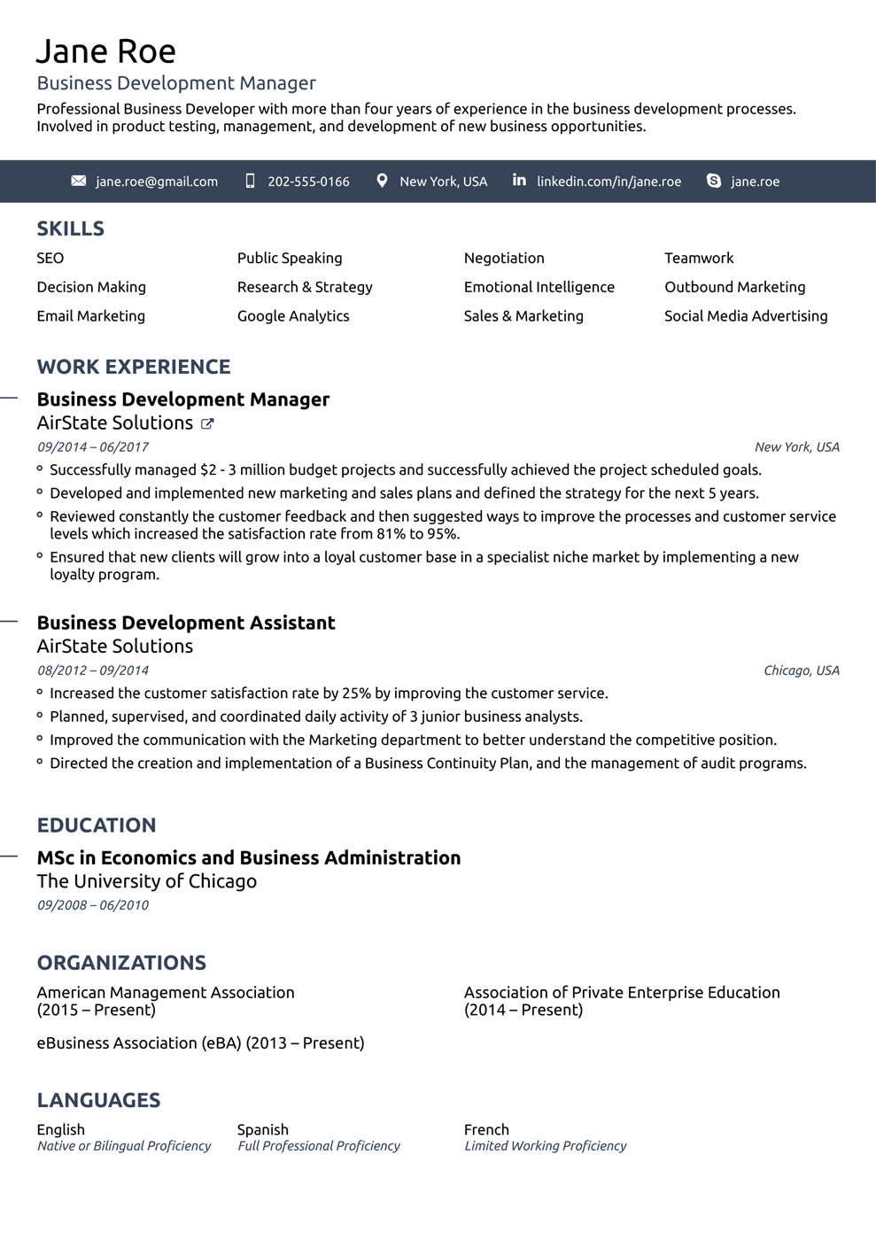
Who’s it for: Senior Positions, anyone with a lot of work experience. Perfect for conservative industries such as law or banking.
Simple by Novorésumé lives up to its name. It’s the perfect resume if you’re looking for simplicity and convenience.
This well-organized, easy-to-read resume format is ideal if you’re in a senior position.
The hiring manager is most probably looking for modesty and tasteful professionalism, and this template helps your achievements shine without any gimmicks.
The black and blue is a needed change from the black and white employers are used to, while still keeping you professional.
#2 - Creative by Novorésumé
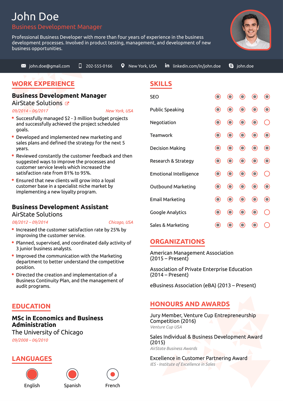
Who’s it for: Someone applying in a creative industry like advertising, marketing, publishing, design; entry-level applicants.
This vibrant template is the right choice if you’re looking to stand out. It brings your skills and work experience into focus in a visually appealing way.
Creative uses infographics and bulleted lists to create a pleasant-looking, stylish resume.
It has a gorgeous four-color combo that leaves a striking first impression.
And, at the same time, the resume still looks professional.
It’s well organized and the design doesn’t overdo it with the playfulness. That’s why we love this template so much: balanced flawlessly, it’s both cheerful and professional.
#3 - Modern by Novorésumé
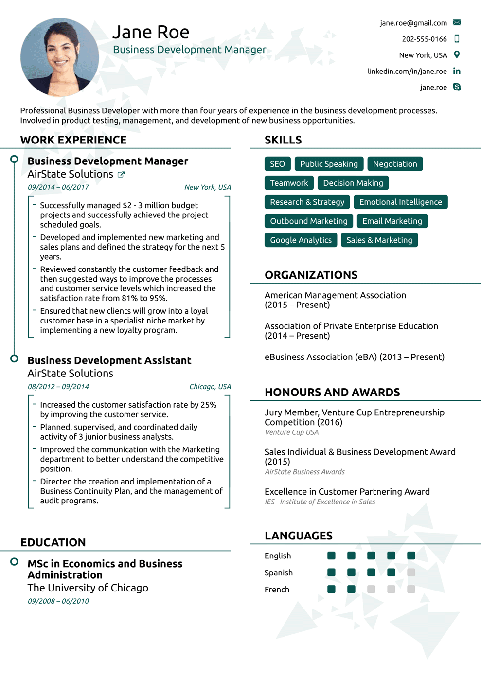
Who’s it for: Professionals in the business or technology industries.
Modern by Novorésumé is a breath of fresh air! It uses square brackets, bulleted lists, infographics, and different icons to attract the hiring manager's attention.
The dark green color gives it a stylish look but keeps everything modest and modern as well.
The resume sections are divided into two columns: they include personal information, work experience, skills, organizations, awards, and languages, all on one page.
#4 - College by Novorésumé
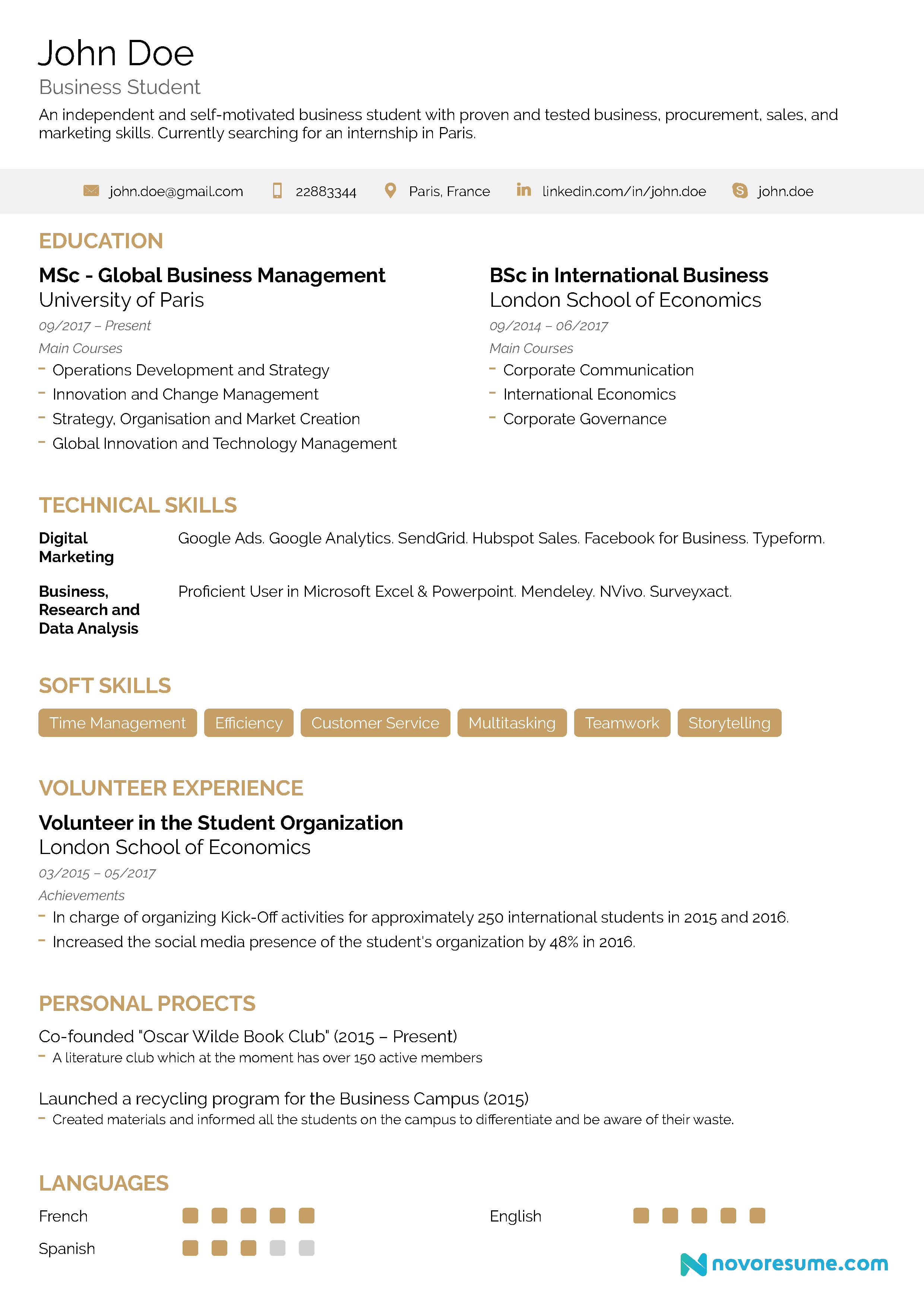
Who’s it for: Recent college graduates with some work experience, current university students
This resume template works best for students & recent graduates applying for internships or entry-level jobs.
Every section is well-organized to provide room for your work experience and skills.
And on top of that, this template is contemporary and visually appealing as well. The blue borders and bold letters give College personality and style, without it appearing tacky.
#5 - Executive by Novorésumé
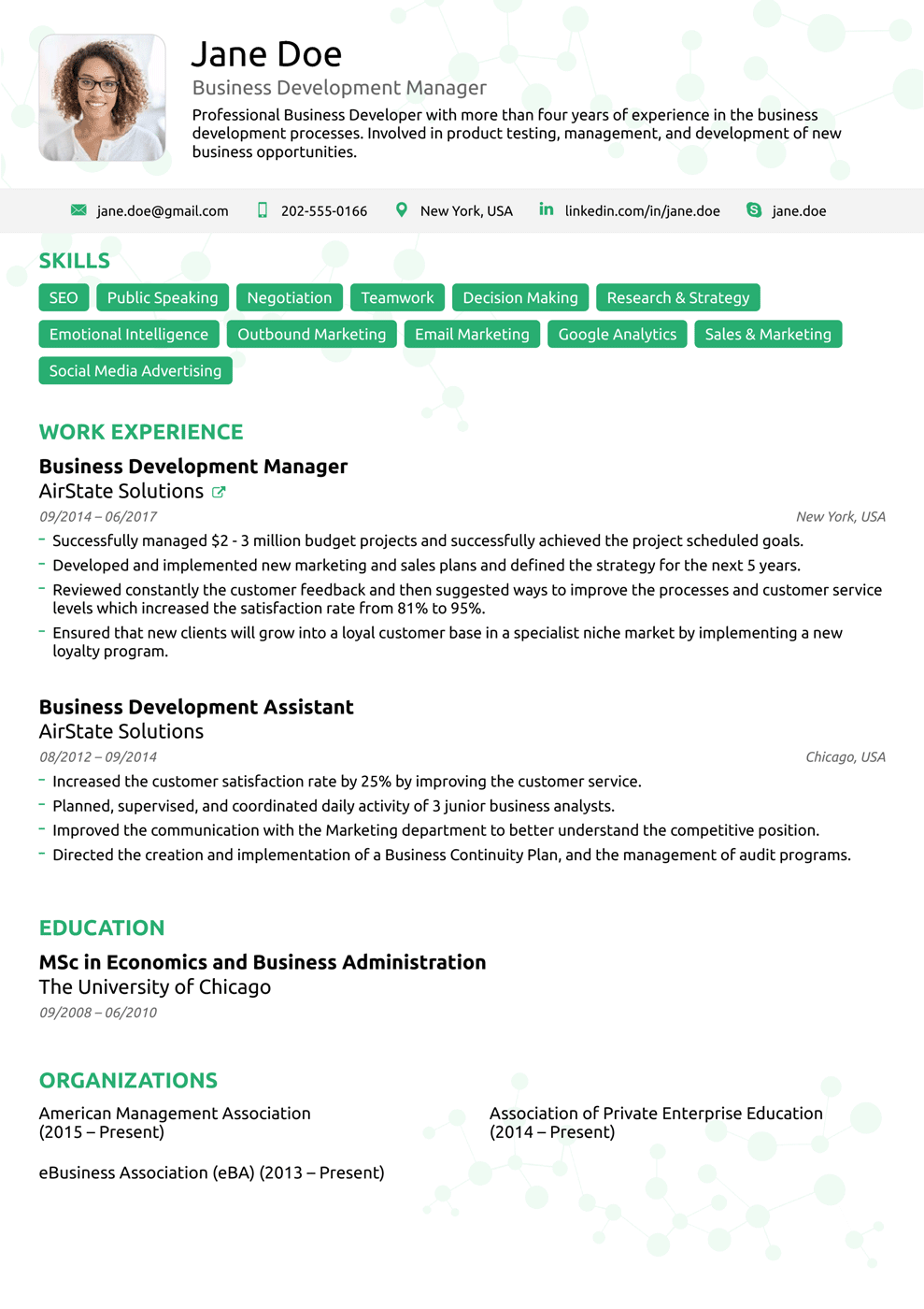
Who’s it for: Senior executives applying in a creative or green industry
Do you need to show how qualified you are for the position AND have your personality shine through your resume?
Executive by Novorésumé does just that.
This vivid resume template features attractive emerald green headings and subheadings. The color makes it stand out and adds a touch of personality.
The emphasis, however, is put into your profile, skills, and work experience.
The skills section is highlighted in green, and it’s the first thing the hiring manager gets to see.
So, make sure to wow them with your best skills.
#6 - Basic by Novorésumé
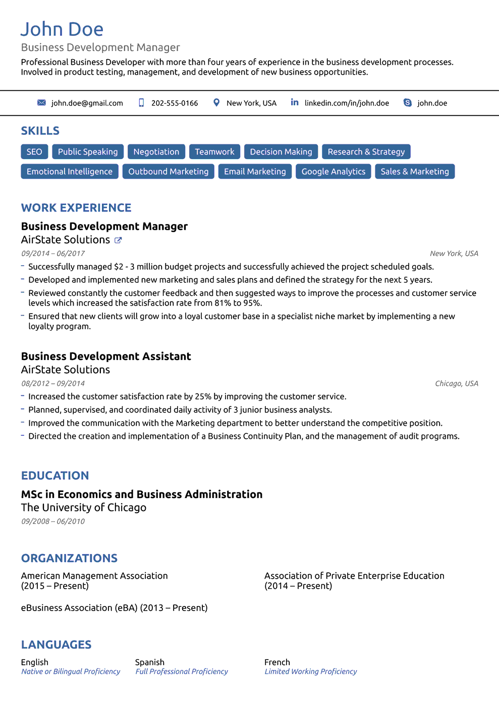
Who’s it for: Conservative, traditional industries
Sometimes, a minimalistic resume is the best resume.
If you want to focus more on the contents of your resume than the design, definitely check out Basic.
Basic offers a concise and well-organized layout. Everything the hiring manager needs to see stands out at first glance, so you’ll have a high chance of landing in the “To-Be-Interviewed” pile!
8+ One-Page Resume Templates for Microsoft Word
A basic black and white resume on Times New Roman is not going to make you stand out from the crowd or benefit your job application.
But that doesn’t mean you have to create your resume on special software to catch the eye of the hiring manager.
Microsoft Word is still a very popular way to create a resume that stands out.
Read on to find 8+ Microsoft Word one-page resume templates!
#7 - Elegant Dark Microsoft Word Resume Template
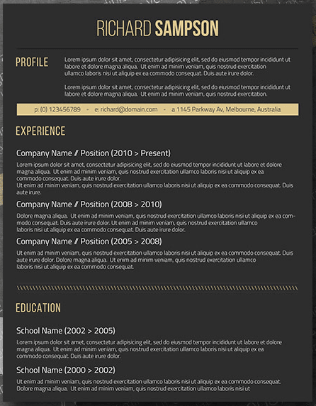
Who’s it for: Anyone applying for a high-end position: senior professionals, executives, etc.
Where to find it: Freesumes
We visualize elegance with Rolex watches and limousines. We don’t often relate elegance to resumes and documents.
Yet this unique, gorgeous template is packed with charm and finesse.
This dark template will assure your resume doesn’t fall into the circular file. It attracts attention because of its unusual white, yellow, grey scheme of colors.
The dark grey of the background reflects seriousness and sophistication, whereas the soft yellow creates a gorgeous contrast that softens the appearance.
It is perfect if you have a lot of professional background since it creates plenty of space in the experience section that allows you to display all of your employment entries.
#8 - Clean and Light Microsoft Word Resume Template
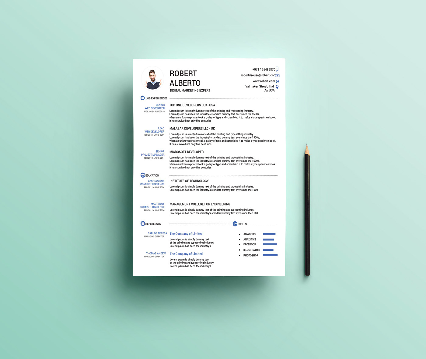
Who’s it for: Someone with minimal work experience. Entry-level candidates and recent graduates.
Where to find it: Behance.net
This lively template is the right choice for you if you don’t have a lot of experience to put into your resume.
It helps you create a profile that sums up your career and values in a minimalistic, refreshing way by using boldface, all-caps, and a two-column structure to make it easy to read for the HR manager.
With the overall simplicity of the black and blue colors, the header on the top sticks out immediately at first glance.
We like it because it’s also easy to use and customize. All entries are scannable and extremely clear-cut. The cherry on top: it comes with a bonus Word cover letter template.
Speaking of cover letters - the right cover letter can really be a game-changer. Check out our complete guide to cover letters and learn what it takes to stand out.
#9 - Equilibrium Microsoft Word Template
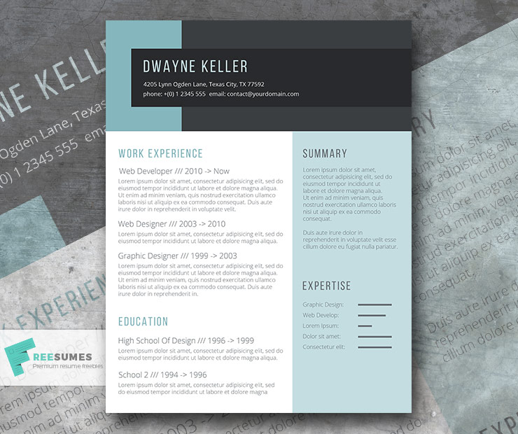
Who’s it for: Any professional and creative role
Where to find it: freesumes
We call this template Equilibrium because it balances formatting and structure.
The layout is strategically made to keep the hiring managers focused on your most impressive achievements.
It uses geometric design and colors to separate sections from one another.
Equilibrium focuses on work experience, education, and emphasizes expertise. You can choose to customize the sections but for the most part, it’s very straightforward and simple to use. Just fill in the blanks and send it in.
#10 - Clean and Compelling Microsoft Word Resume
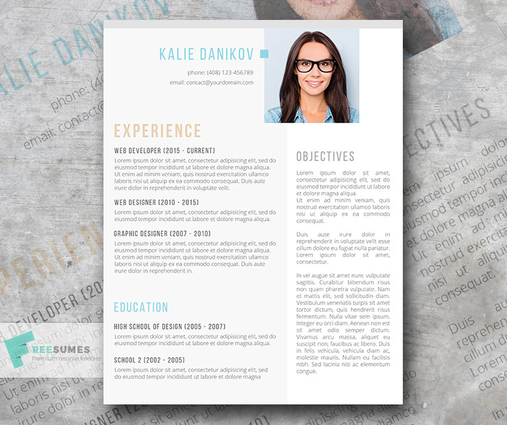
Who’s it for: Recent graduates, entry-level applicants.
Where to find it: freesumes
This modest template is going to surely help you win over any HR manager.
You can use the Objective section on the right to communicate your goals and ambitions to potential employers.
While this isn’t a section you’d typically see on a resume, if done right, it can really have an impact.
The warm colors used are awesome for standing out and catching the HR manager’s eye.
The faded grey in the background adds formality as well as divide the sections. Finish with a professional photo on top of the resume, and you’ll be set for success.
#11 - Police Officer Resume Template
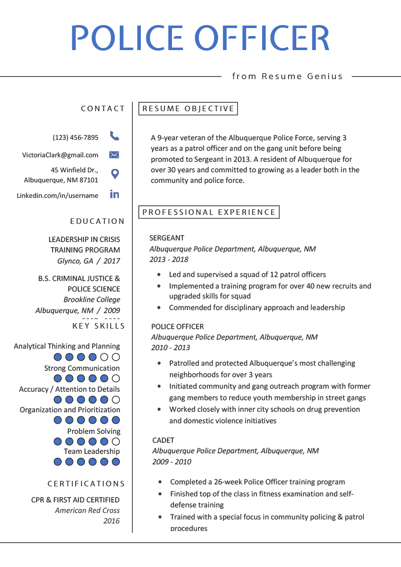
Who’s it for: Law enforcement officers
Where to find it: smashresume
If you work in law enforcement, this template is hand-made just for you..
It’s well organized and professional and also divided into two columns to save you space.
One column includes your personal information, education, key skills, and certifications.
The other covers your resume objective and professional experience.
This template is creative as much as it is systematized. There are plenty of icons, infographics, and columns that break the monotony.
The font is neat and groovy and the icons have a splash of protective blue that adds personality.
Package features include:
- A4 paper size
- Free font
- Customizable and editable objects, color, text
#12 - Web Designer Word Resume Template
Who’s it for: Web developers and designers.
Where to find it: behance
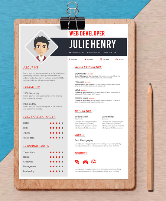
Innovative and artistic, this resume is a gem to look at.
Web Designer by Venkata Naresh follows a color scheme and layout that’s been made particularly for people working in the web industry.
It includes a contact information section, education, professional skills, personal skills, profile, work experience, awards, and hobbies.
This template also comes with:
- A CV and Cover Letter
- 3 Color Styles
- Dark and Light Versions
#13 - Vintage Rose Word Resume Template
Who’s it for: Marketers, influencers, bloggers
Where to find it: freesumes
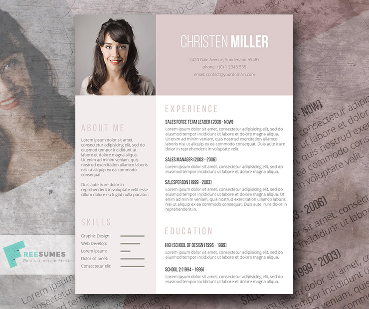
Because of the vintage rose color, this resume is a bit on the feminine side.
This Word Template is a big employer charmer because it displays all important information at first glance; all on one page!
The layout is made to highlight your work experience, brand, and achievements.
The “Skills” area has bar charts to take the spotlight, whereas the “About Me” area gives you some space to present your personality.
Vintage Rose is ideal if you want a clean and modern resume, with just the right amount of style.
#14 - Goldrod Yellow Word Resume Template
Who’s it for: Any creative role
Where to find it: freesumes
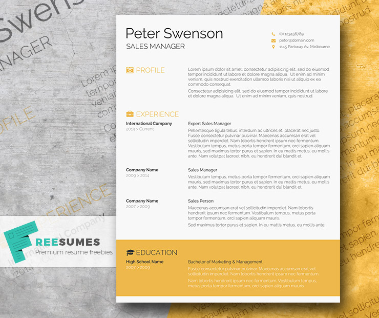
This Word template uses a bright yellow as a leading color, making sure that your resume really stands out from the bunch.
The warm color reflects positivity as well as makes the resume stand out from the pile.
Professionalism doesn’t get lost in the process, though. Everything is easy to use and customizable.
Extra tip: You can choose to change the big “Education” banner on the bottom to a “Skills” section if you think they should take priority.
For a full extensive list of Microsoft Word resumes, check out our complete guide [with free downloads].
6+ One-Page Resume Templates for Google Docs
Some ready-made Word templates can be tormenting. You start making some changes, and before you know it, the entire layout gets completely messed up.
That’s not a problem you will have with Google Docs templates, though.
Google Docs resume templates in this list are customizable online, efficient, neat, convenient, and most importantly: 100% FREE.
#15 - Border Design Google Doc Resume Template
Who’s it for: High school and college graduates
Where to find it: Google Docs
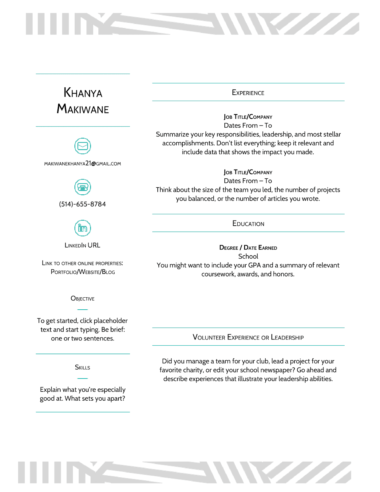
Are you a student or graduate with not much real-life work experience? This template is for you.
There are plenty of different sections any student or graduate can fill in with personal information: skills, objectives, volunteer work, education. Our favorite part: this template is pleasant to read and has a lot of personality as well.
The mint borders and small icons, various social media links and simple font keep everything original and tasteful.
#16 - Serif Google Doc Resume Template
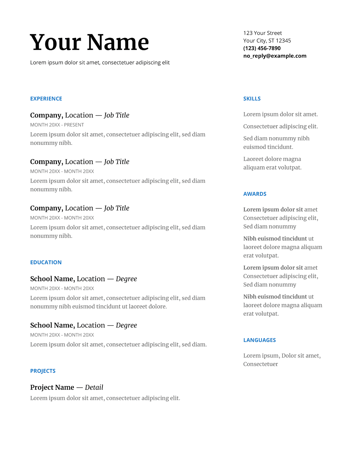
Who’s it for: Someone in a senior position, banking, computer scientist
Where to find it: Templates Gallery
This resume has a blue pop of color that creates a neat first impression while keeping things professional.
It gives you a lot of space to show off the work experience, skills, awards you are most proud of.
It also saves an extra sweet spot if you want to list your languages.
#17 - Simple Professional Google Docs Resume Template
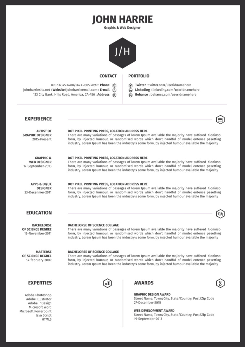
Who’s it for: Senior professionals in marketing or advertising, web & graphic designers
Where to find it: Google Docs
This modern-looking one-page template is perfect for marketers, advertisers, and web designers.
It offers plenty of considerable space to talk about your achievements and experience.
Icons are kept minimal, and the layout is elegant and clear-cut.
#18 - Blue Creative Google Docs Resume
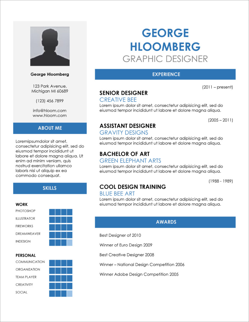
Who’s it for: Marketers and social media experts
Where to find it: Google Docs
Applying for a design job where you’ll be making plenty of web content?
Then don’t miss this striking infographic resume!
The Google Docs template uses a strong shade of blue and aesthetic visualizations to highlight each header and section. Fun and appealing, it features a header, skills, awards, experiences and an “about me” area.
#19 - Modern Writer Google Docs Resume Template
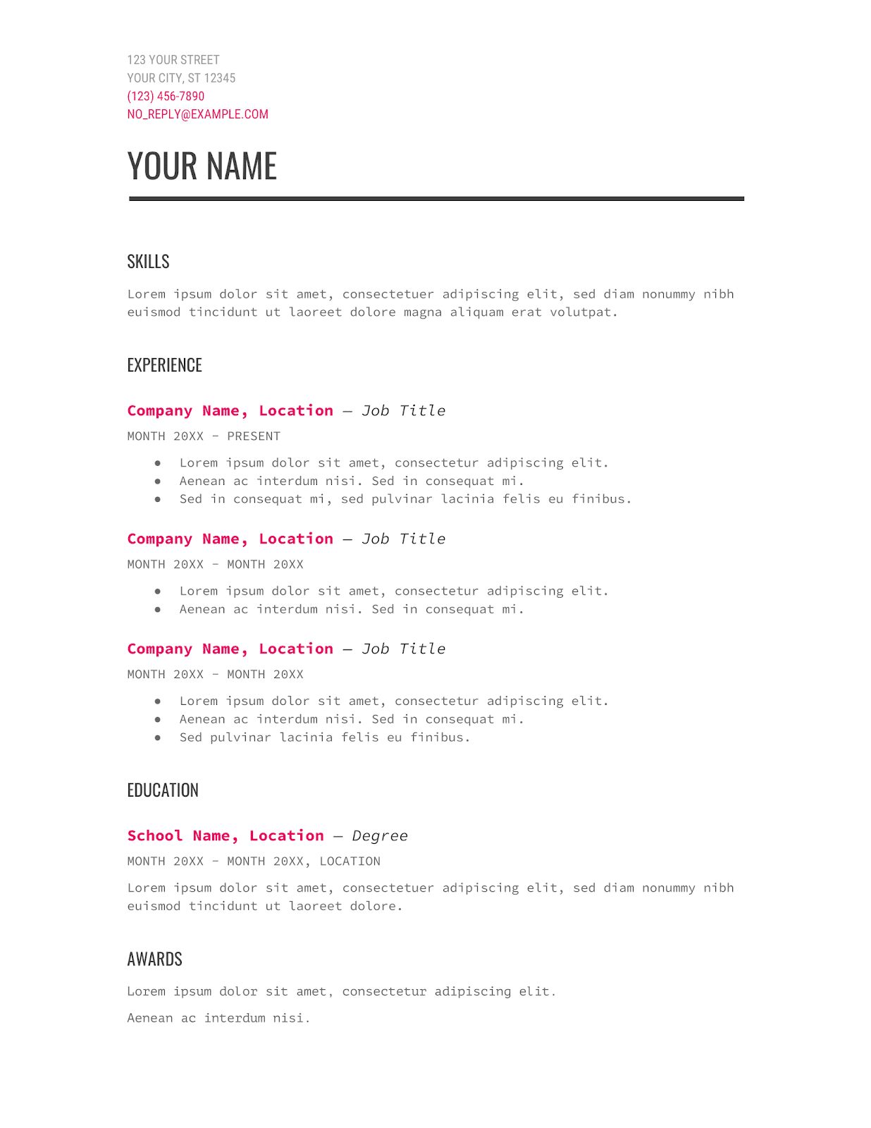
Who’s it for: Book editors, journalists, librarians, copywriters, scriptwriters, web content writers.
Where to find it: Templates Gallery
Yes, this template is exactly what you think it is: a resume for the modern 21st Century writer.
So, if the job you are applying for is related to books, scripts, publication - this is the right choice for you.
The “Modern Writer” is unique since it has a classy font and a showy pop of pink color. The header gets highlighted too, because of the thin black underline.
#20 - Smart and Professional Google Docs Resume Template
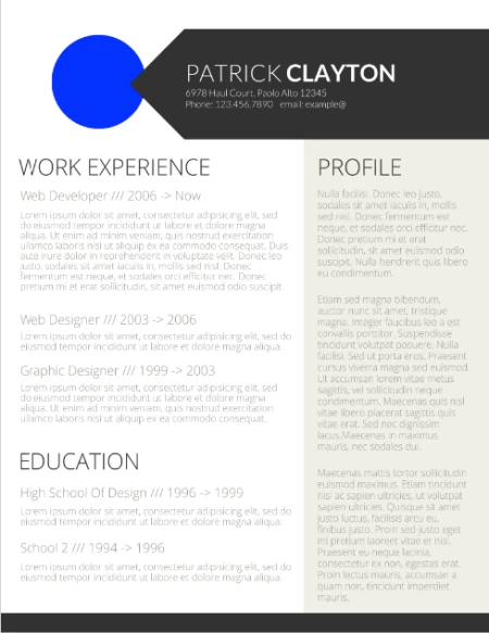
Who’s it for: a professional with a lot of experience and education
Where to find it: in this direct Google Docs link
This smart template is for the overqualified candidates.
It puts its focus into three main categories: work experience, profile, and education.
All sections have a good deal of space you can write your long professional track record in.
Contrary to regular templates, this template features a colorful header that’s eye-catching.
Want to discover more Google Docs resume templates? We have an article for that!
Key Takeaways
Hopefully, we helped you find the right one-page resume template!
Not sure which one to pick? Let’s briefly go through some of the most important things to keep in mind when choosing your one-page resume template:
- Pick a template that’s relevant to your field. If you’re applying for a banking job, you don’t want your resume to be sunshine and rainbows.
- Pick a design that’s going to stand out (but not too much). Standard, black-and-white resumes are nice, but that’s what everyone else does.
- Want to make your life easier? Use a resume builder. You won’t have to suffer the pain of Word messing up your template!’
Discover More Resume Templates
- Chronological Resume Templates
- Functional Resume Templates
- Combination Resume Templates
- Creative Resume Templates
- High School Resume Templates
- 2 Page Resume Templates
Suggested Readings:
