When you’re working on your resume the font might be the last thing on your mind.
But details matter.
And something that might seem insignificant at first, like your resume font, can have a huge impact on whether you get the job or not.
Why’s that?
Consider the resume readability.
You may have the best resume in the world, but if the font is assaulting the HR manager’s eyes, well, chances are, they’re not going to give you a call back any time soon.
Similarly, if you go with the most boring font that’s almost camouflaging with the background, they just might forget about your resume by the end of the day.
Most HR managers don’t spend a whole lot of time on actually analyzing your resume. The very first they look at is the resume layout and only then do they go through the contents.
If the layout is good (e.g. 1 page, looks good, easy-to-scan, etc.) and the font looks readable - only then will they decide if it’s worth a read or not.
And remember, this is only done in a matter of seconds.
So, imagine someone glances at your resume. What first impression is your font giving off?
Do you want your resume to stand out and go in the right box?
If so, read on to find out:
- What's the Best Resume Font & Size
- How to Format Your Resume
- How to Make Your Resume (The Easy Way)
What’s the Best Resume Font & Size
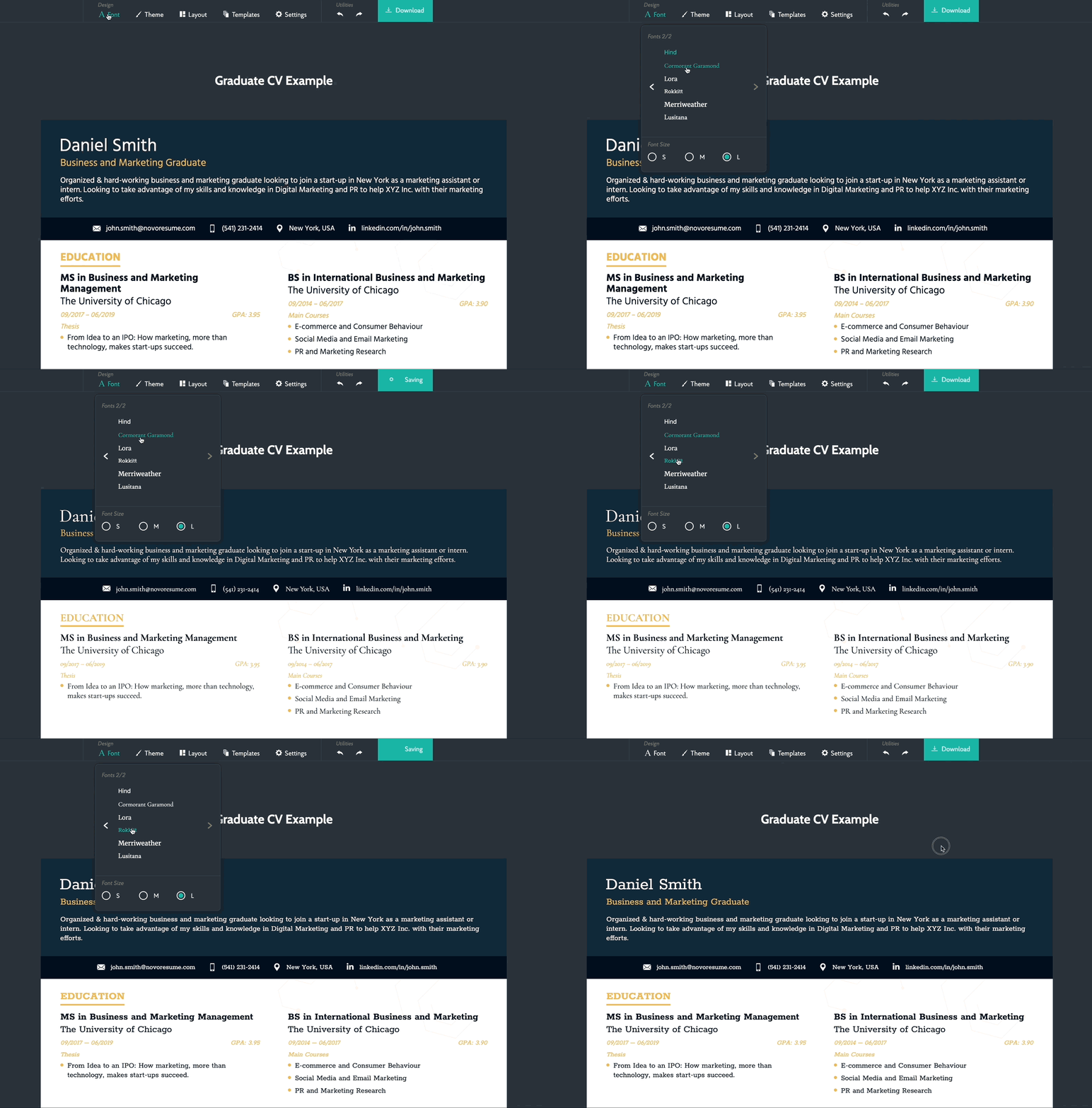
When it comes to font and font size, we generally recommend going with something that stands out, but not too much.
The font you go with has a direct impact on the readability, and so, it needs to look good on PDF as well as paper.
Before we dive into the best resume fonts though, let’s take a look at one font you shouldn’t ever use:
Comic Sans.
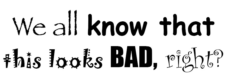
Yes, you’ll stand out. No, not in the good way.
Jokes (and bashing comic sans) aside, the most common font people tend to use is Times New Roman, 12pt.
Now, there’s nothing necessarily wrong with that, but you should know that it’s going to be the default font for most people.
Do you want your resume to stand out among all the Times New Roman resumes?
If so, consider using:
- Ubuntu - Ubuntu is a modern, humanist-style, typeface developed in 2010. It looks great everywhere, maximizes readability, and does not belong to any specific industry. You can use it for all job applications and your resume is guaranteed to stand out.
- Roboto - Looks familiar? You might recognize this font because Google developed it for its Android operating system in 2011. But don’t worry, it’s free for commercial use. It has a tech look to it, but feel free to use it in any industry - tech or otherwise.
- Overpass - Relatively newer font, developed in 2015, Overpass is a digital typeface font inspired by Highway Gothic. It looks very formal and classy, making it ideal for more conservative industries. But you can’t go wrong with using it in other industries as well because of its sleek design.
Once you’ve picked your font, you move on to:
Resume Font Size
In a resume builder, such as ours, the font sizes are pre-defined in order to create a font hierarchy across the document that will result in increased readability of your resume.
When faced with a situation where you are not relying on a resume builder and have to choose the font size yourself, as a rule of thumb, we recommend going with 10-12pt for normal text and 14-16pt for section titles and headers.
This approach should save you some space and also won’t make the HR manager have to squint to read the text.
It’s important to note that once you decide on a font and font size, they should be consistent throughout the whole resume.
Basic Layout Info
When it comes to the resume layout, here’s what you need to know:
- Line spacing - Go for 1.0 or 1.15 line spacing between text and double lines after subheadings. Feel free to adjust this accordingly based on the space of your resume
- Bullet points - You can use bullet points in your resume experience section to make it easier to skim through. Just make sure you don’t overuse them, limit them up to 6 points within each section.
- Resume length - Stick to one page, unless you have 5+ years of experience (2/3 pages at most, in that case).
So, once you’ve got the basic layout and the feel of your resume down, you can now move onto actually writing the main sections within your resume. Here’s how you do that:
How to Format Your Resume
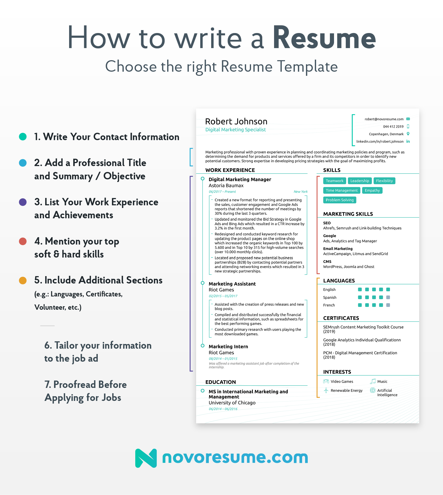
You probably already have a general idea of what you should include in your resume.
Sounds simple, right?
Simply list your qualifications and call it a day.
Well, not quite.
The sections you list on your resume have to be relevant to the HR manager and the job you’re applying for.
No one wants to hear your whole life and backstory.
Instead, here’s what to include and how.
Contact Information

Let’s start with the basics.
Your name, professional title, email address, contact information. These are all things that go on any resume ever.
After all, they need a way to contact you, right?
Make sure the spelling is correct, and everything is up to date.
Thinking of including your social media handles?
As long as they’re relevant - go for it.
Your LinkedIn profile is important for most HR managers.
But your Behance link might be relevant only if you work in design. Likewise, you might want to include Github only if you’re in IT.
Resume Summary or Objective?
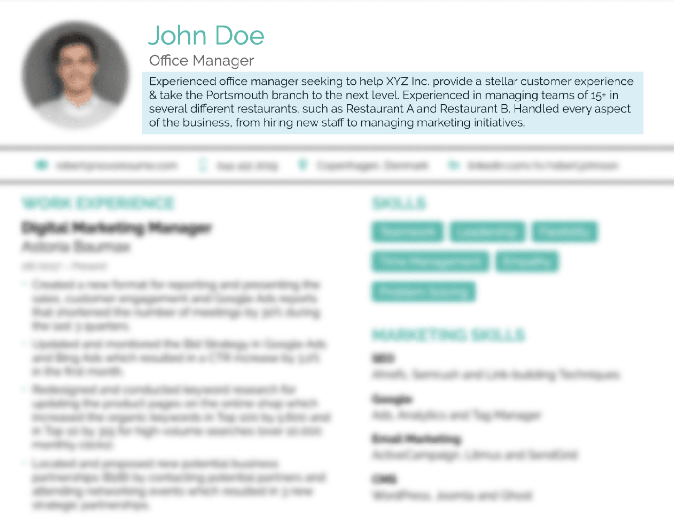
Do you have more than 2 years of work experience?
Include a resume summary that sums up your previous jobs and qualifications in 50 words or less. Don’t just repeat what’s on the resume below. Instead, offer insight that might compel the HR manager to learn more about you.
Now, if that’s not the case, feel free to include a resume objective that mentions your motivations and why you’re the perfect candidate for your job. If you don’t have a lot of experience, feel free to lean on what inspires you instead.
Work Experience
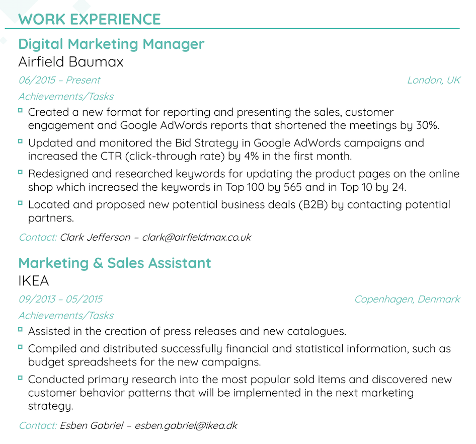
This is the section most HR managers jump to in your resume.
If you want to convince them that you’re the right fit, make sure you list work experience that’s relevant to the position and offers actionable insight.
If possible, quantify the impact you made when working for each role and be very specific about your contributions.
- Improved revenue by 20% by optimizing Facebook ads.
- Created Facebook ads.
At the end of the day, the HR manager wants to hear about your accomplishments, not responsibilities.
Skills
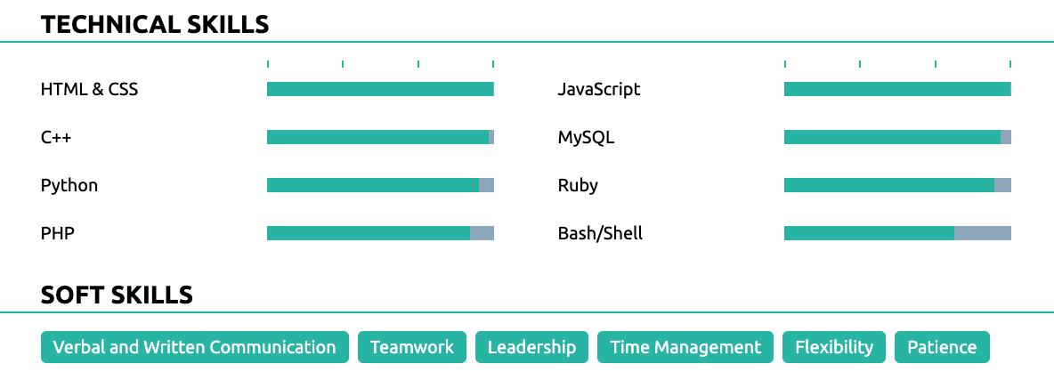
Most job ads typically list the type of skills they’re looking for straight away. This is your chance to stand out and prove to the HR manager that you’ve actually read the job ad.
To perfect your skills section, get a good mix of hard and soft skills.
What’s the difference?
Well, your hard skills include specific knowledge and expertise that comes from training. For example, if you’re applying for a tech job, your hard skills should include specific knowledge needed for the job.
For example:
- Python
- Java
- C++
Your soft skills, meanwhile, are self-developed and come from experience. I.e. skills you’ve learned from life, such as communicating with people, working in a startup, and so on.
For example:
- Leadership
- Communication
- Self-Driven
When thinking about some of the skills to put on your resume, read the job ad carefully. You want to mention the skills that are relevant for the job - no one cares about your Expert knowledge of Underwater Basket Weaving.
Education
This is fairly straightforward, yet, many people make the mistake of filling this section with unnecessary information.
When writing your education section, only include the important things, such as:
- University name
- Major (s)
- Years attended
- (Optional) GPA - Is it more than 3.5? Then you might want to include it.
- (Optional) Honors - Were you top of the class? Go for it.
- (Optional) Minor program - Relevant to the job? Feel free to include.
Keep it simple, no need to waste space with the background of your university or what motivated you to choose your major.
Optional Sections
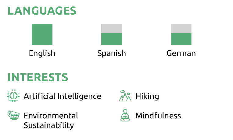
Want to stand out from the crowd AND leave a good impression? Some of these optional sections might help…
- Hobbies and interests
- Volunteering Experience
- Projects
- Languages
- Certifications and Awards
- Publications
There’s a lot more to making a good resume than what we’ve covered so far. Want to learn more? We have a super-comprehensive guide for that. Give it a read, and you’ll be an expert in no time!
How to Make Your Resume (The Easy Way)
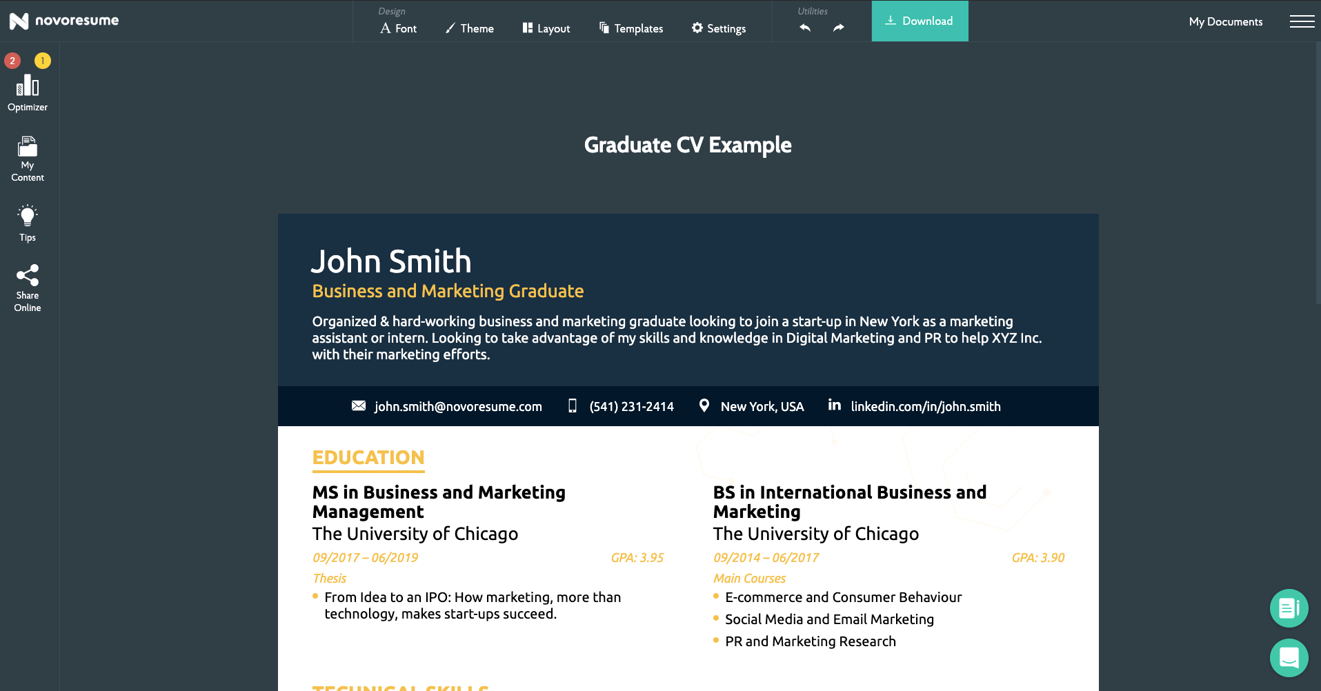
Now that you know what goes in a resume, you might be wondering - “what’s the best way to make one?”
Yes, you can do the whole thing manually and hand-craft your own resume with Microsoft Word
But think about it - do you really want to go through all the hassle?
If you’re going to be hand-crafting your resume from scratch, you need to get everything right.
You need to format it right, get the layout right, make sure it’s ATS-friendly (CV screening software HR uses), and really dive into the details.
This is extremely time-consuming.
Instead of manually knitting up a resume, you could be making better use of your time.
Work smarter, not harder, right?
If you want to make your life easier, try Novorésumé’s resume builder. It’s free (with premium options) and really simplifies the process of creating a resume.
Our templates were developed with recruiters and employers in mind, so you can rest assured that you’re always sending in your best work.
Whether you’re a college student or a senior executive - Novoresume templates have your back when it comes to best resume formatting practices.
Key Takeaways
Ready to get back into the job search with the best resume font practices that will have the HR manager grabbing your resume from a full-stack?
Make sure your resume font reflects that and that it’ll have your resume radiating with the font choice the next time you send it in.
Here’s a quick recap of what we’ve learned so far:
- Best resume fonts are: Ubuntu, Robot, Overpass. The worst one? Comic Sans
- Best resume font sizes are: 11-12pt for normal text, 14-16pt for section titles and headers.
- The most-used resume formatting order is: Contact information, work experience, skills, and education.
With that said, if you don’t want to worry about the specific resume formatting and getting the details right - you can always use a resume builder to make your life much easier.
There is no reason as to why you should be pouring your sweat, blood, and tears into the painstaking hours of perfecting your resume, down to the margins and fonts manually, when you can just use a resume builder (which is free) to do it for you.
If you want to learn other ways to save time and stay up to date with the latest career advice, be sure to check out our career blog.
Suggested reading:
