HR managers receive a ton of resumes each day.
And going through every single one of them is a slow and time-consuming process they’re not going to commit to.
So, in most cases, they simply glance through them instead, for as little as 6 seconds.
Now, let’s be real, 6 seconds is really not enough time to take in a resume and decide if they’re going to make for a good candidate or not. If anything, 6 seconds is hardly enough time to read one section of a resume. And that’s the point, HR managers are not reading your resumes.
That’s right.
They simply scan through them and then decide if it’s actually worth reading or not.
This is why your resume layout is so important.
Because let’s face it, even if you have the best resume in the world, the HR manager is just going to put it away and never come back to it unless it looks easy to read at first glance.
They typically check if the resume layout looks simple, well-organized and if it’s easy to scan through, and then go from there.
And if they don’t see the simple resume layout they’re looking for - it’s definitely getting discarded, no matter how good it is.
So, read on to learn how to get your resume layout right.
- How to Take the Easy Way Out - Use a Resume Builder
- Resume Layout Design Rules: Margins, Spacing, Fonts, Font Size, and More
- 3 Best Resume Layout Examples and Templates (Updated for 2023)
- How to Format Your Resume - 3 Main Formats
- Content to Put on Your Resume
- Key takeaways
How to Take the Easy Way Out - Use a Resume Builder
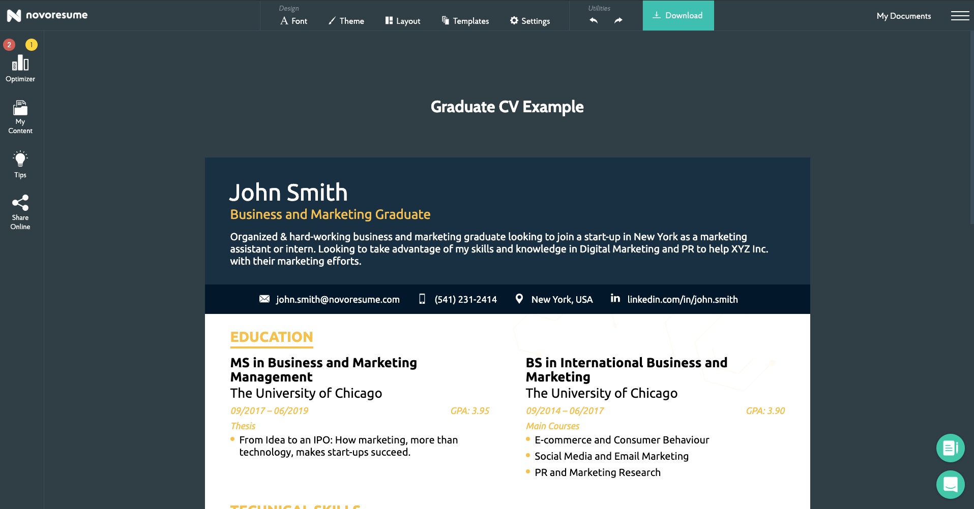
Why use a resume builder?
Well, if you’ve used the default Word resume template before, then you’re probably all too familiar with what it’s like to craft something presentable, only for the whole layout to go haywire with just a single tweak.
With a resume builder, the formatting is done for you right off the bat. And if you want to handle the formatting on your own - you’re in charge of all of the sections and elements that go in a resume as well.
So what are you waiting for? Give the Novorésumé resume builder a try!
If you’re still interested in formatting the resume on your own, though, that’s fine too! Read on to learn how to get your resume layout right.
Resume Layout Design Rules: Margins, Spacing, Fonts, Font Size, and More
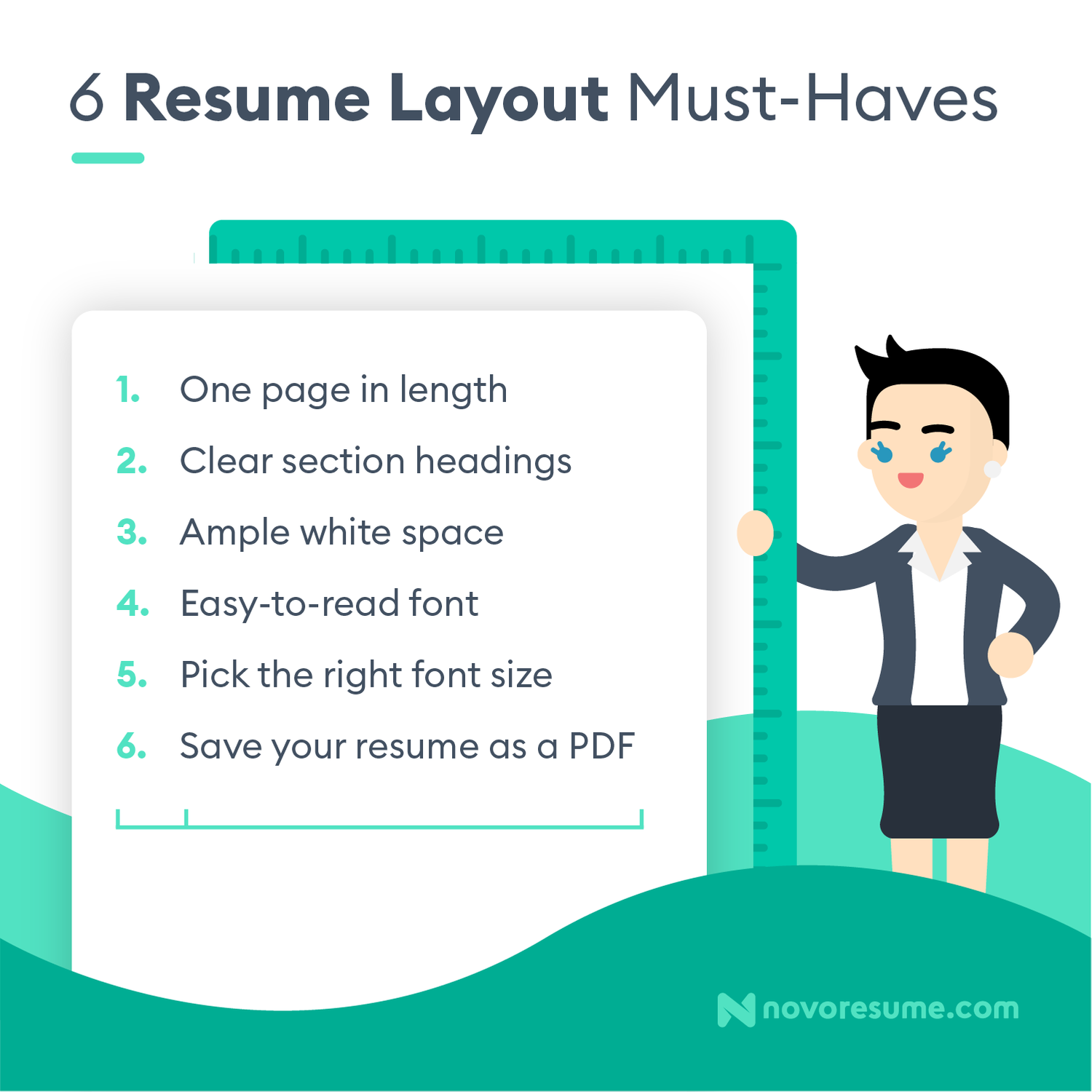
You don’t have to be a designer for this, but by the end of it, you should have an idea of how your resume layout should look like.
First, let’s take a look at what the design part includes:
- Margins
- The right font
- The right font size
- The right line spacing
- Consistent design
- The right length
As general advice, aim for consistency, try to have white space around the margins, and include fonts that stand out, but not too much.
Now, let’s take a look at the design sections in more detail:
Margins
You’ll want your resume to have some space in between the sections so that everything is spread out evenly. There needs to be spacing throughout the resume so that it’s easy on the eyes and there is enough room to breathe.
Using the Right Font
Sounds pretty obvious, right?
The font you choose has a direct effect on the readability of your resume.
So, as a rule of thumb, stick to fonts that won’t give the HR manager an eyesore. Instead, pick something easy to read on PDF as well as on paper,
We recommend using Ubuntu, Roboto, and Overpass.
And, of course, never use Comic Sans.
What’s the Right Line Spacing
To save space, go with a 1.0 or 1.15 line space for most text.
Keep Your Resume Design Consistent
The resume design includes things mentioned until now: margins, font, font size, spacing, colors and more.
Once you stick to a design choice, make sure it’s the same throughout the whole resume.
Use Bullets in Each Section (Up to 6-10)
You can use bullet points to sum up your work experience in each section.
Just make sure you don’t overuse them - stick to up to 6-10 bullet points in each.
Keep Your Resume The Ideal Length
The best resumes are 1 page in length.
HR managers get thousands of resumes per month - when an extra page for every resume adds up, they’re not going to spend their valuable time going through them.
Whether you’re an experienced CEO with 20 years of experience, or an intern looking for your first job, you should always try to keep your resume to the 1-page max.
3 Best Resume Layout Examples and Templates (Updated for 2023)
Creating your own resume layout from scratch can be a tough and slow process. Instead, if you want a smoother alternative, you can use a creative resume template to speed it up.
Using a resume builder also gives you the advantage of being able to customize your resume based on your profile and the job you’re trying to get.
If you’re not sure what your resume layout should look like though, here are a few examples to get you started:
Functional
Looking for a simple resume layout for all industries?
This functional resume template will emphasize your strengths and work experience professionally, while still managing to stand out from the masses.
This is a great approach if you want to emphasize your skills and abilities. As a skill-based resume format, it allows you to focus on what you’re good at, while also allowing you to list your work experience in a structured way.
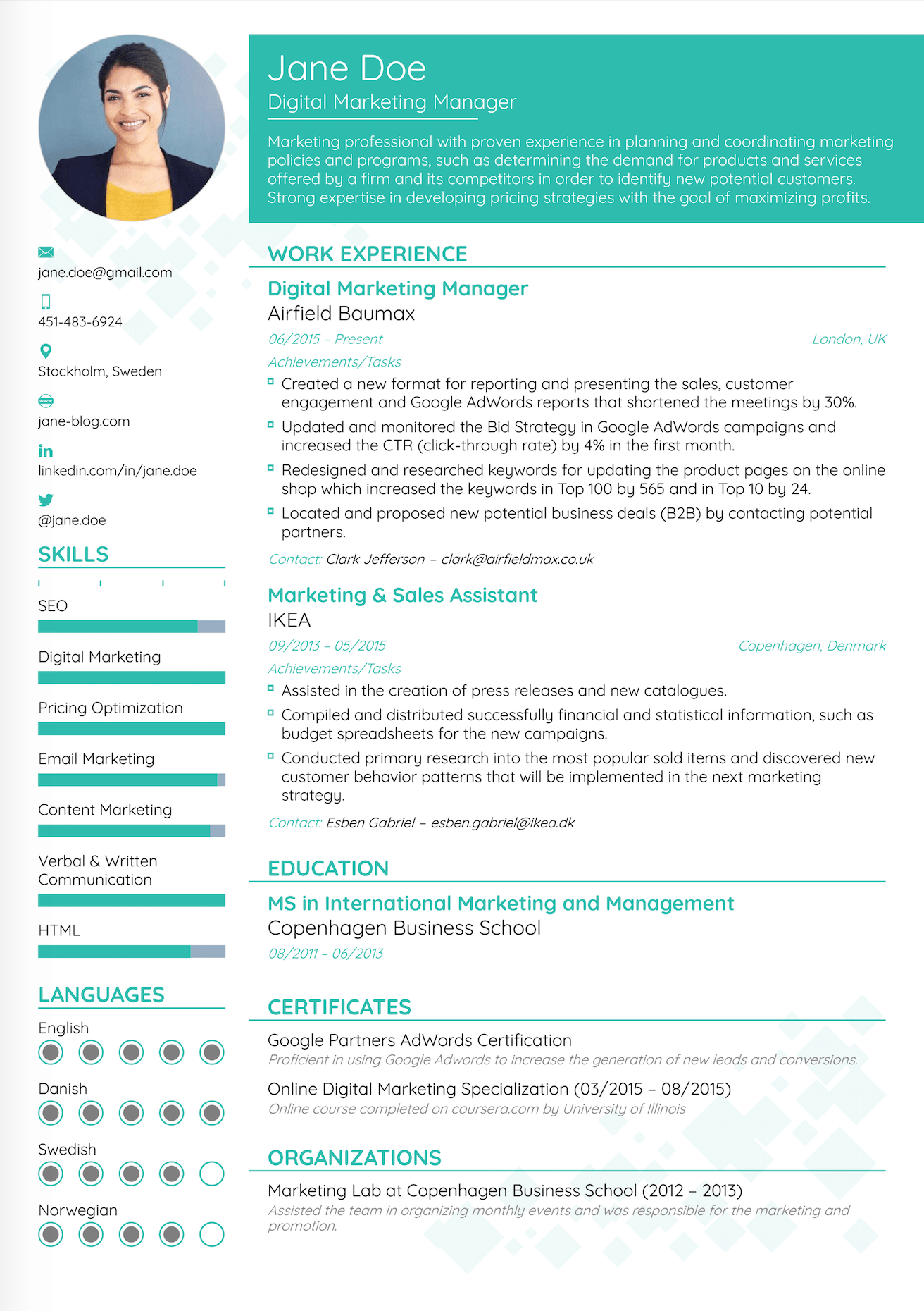
Creative
Depending on where you’re applying, you can opt-in for a more creative resume layout.
For example, if you want to get a job at an online startup where imagination and innovative thinking are valued, feel free to let your creative side shine.
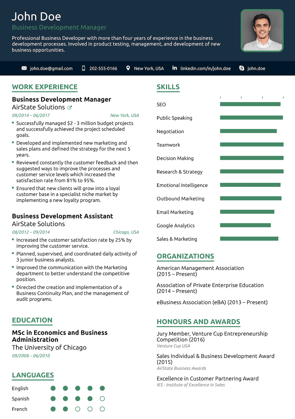
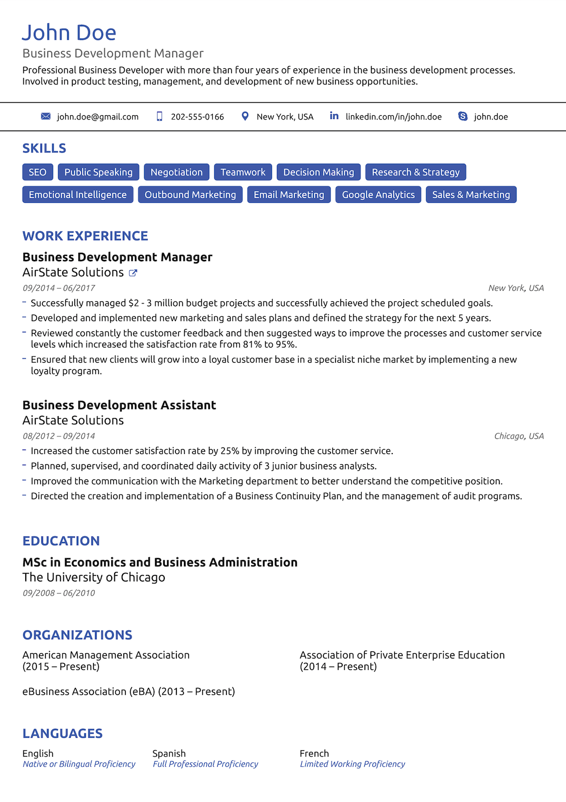
Simple
Simple doesn’t mean bad.
If you’re applying for a job in a more conservative industry, this minimalistic resume layout might be the way to go.
It’s a step up from the traditional resume, and professional enough to stand on its own.
How to Format Your Resume - 3 Main Formats
Once you’ve got the best resume layout down, depending on where you’re applying, you also need to do some formatting,
What does this mean?
Well, essentially, there are 3 main formats your resume can follow. Each one is ideal for a specific case, and they are as follows:
Reverse-Chronological Resume Format
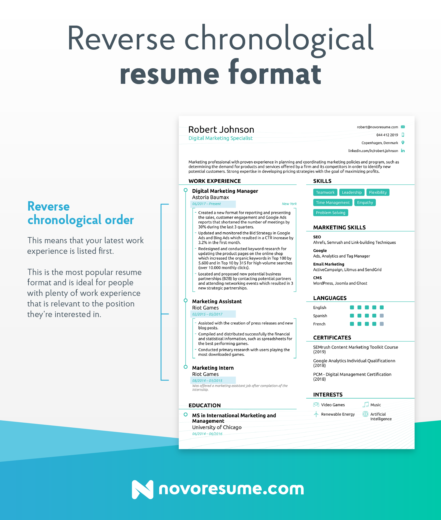
This is the resume layout most job seekers go with and probably the one you’ve been using so far. It’s pretty much the industry standard.
With this format, you’re putting more emphasis on the work experience section than all the other ones.
99% of the cases, you’d want to stick to this format. You might want to consider the other two if you’re either a student / recent graduate (functional) or very senior in your field (combination).
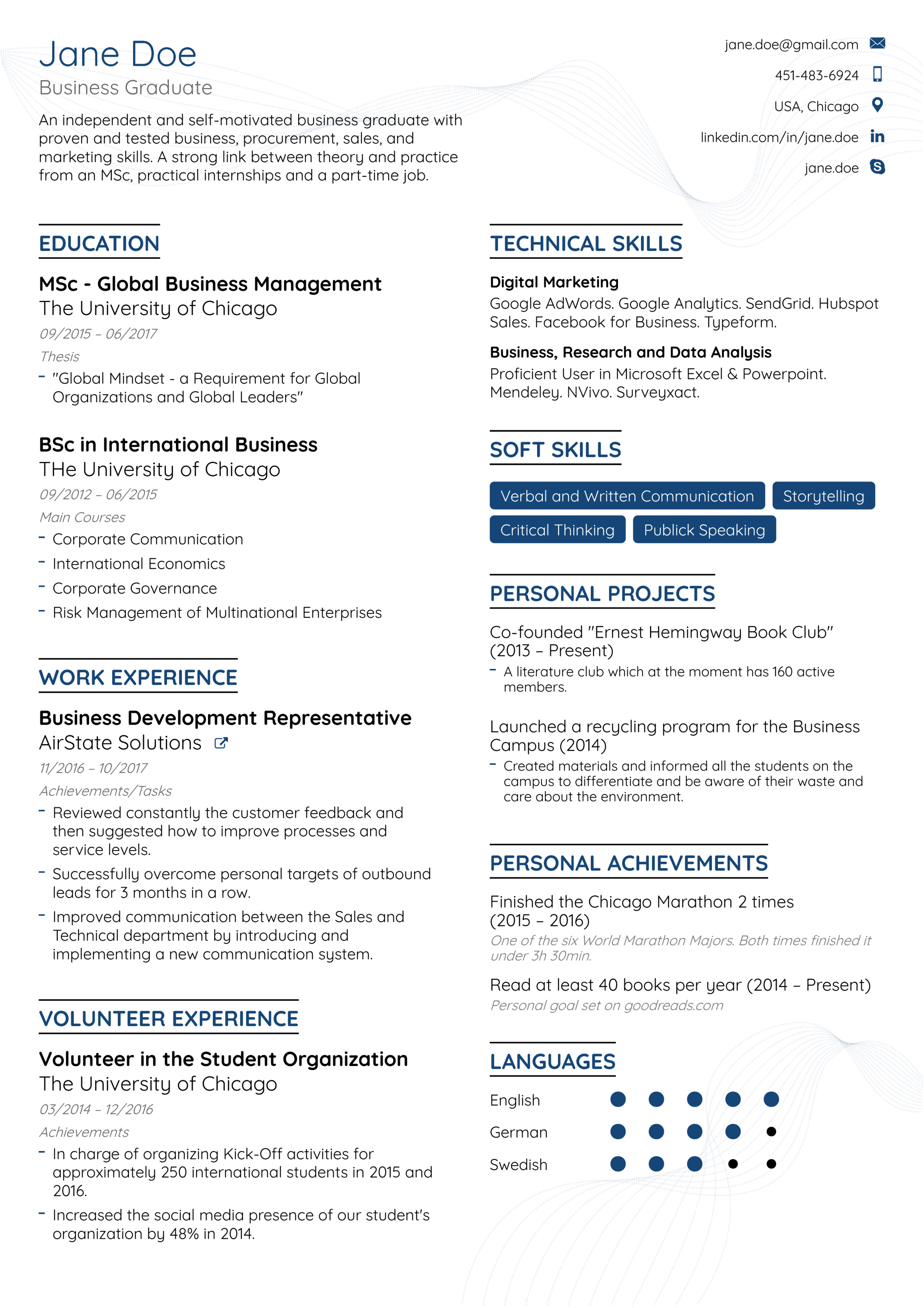
Functional Format (skill-based)
Feeling unsure about your work experience?
If you’re a recent college grad or someone who doesn’t necessarily have a whole lot of work experience, a functional resume format might be the one for you.
The functional resume format, often also called a skill-based one, focuses on your skills and abilities.
The functional format often has the following sections:
- Resume objective
- Skills summary
- Work experience
- Education
- Other
Combination Resume Format (Hybrid)
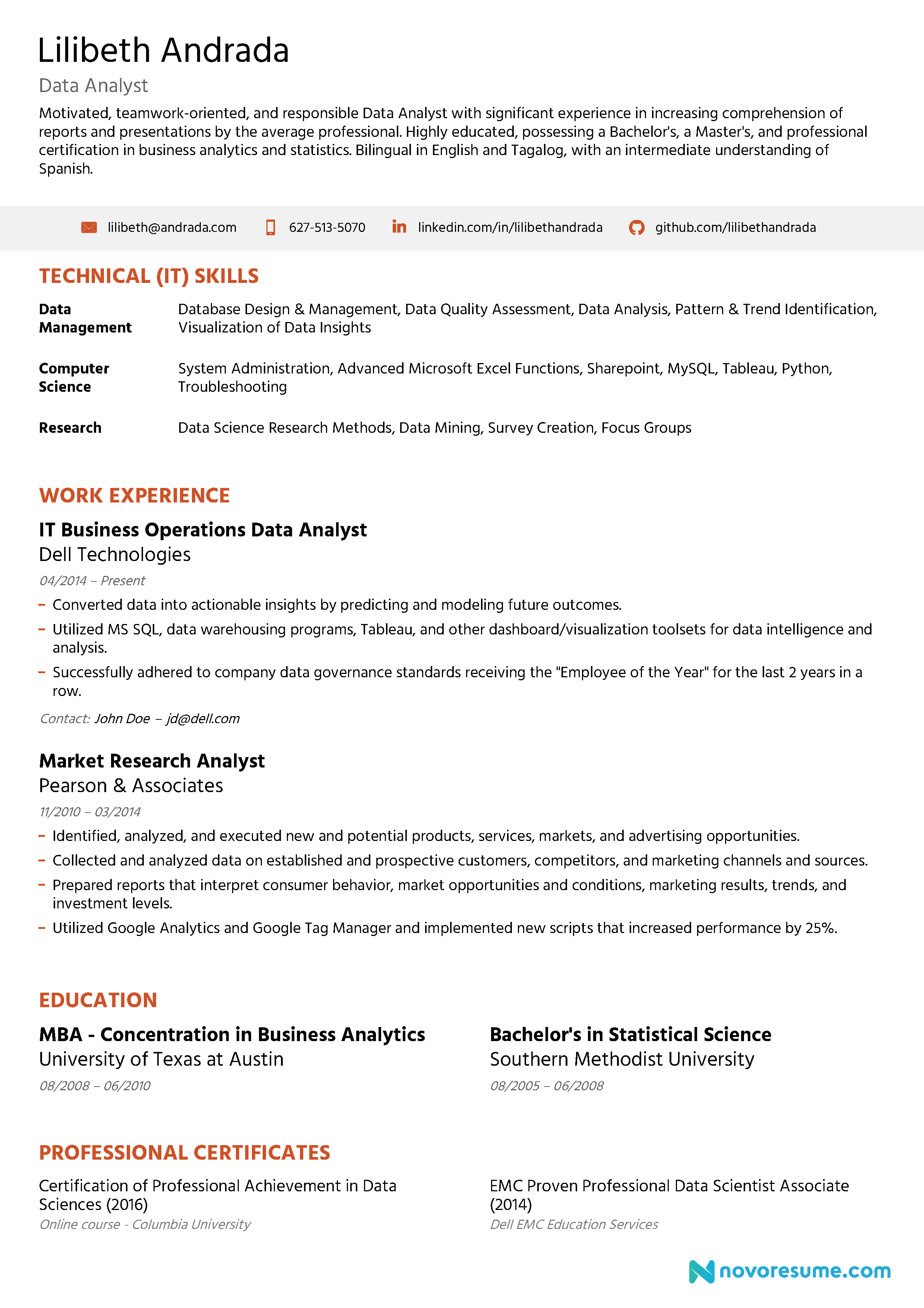
Finally, the combination format, as the name implies, is a hybrid of the other two resume formats.
It is a very middle-ground approach as it gives equal weight to your skills as well as your experience by combining the two formats above.
The combination resume is rarely used, as it’s mainly good for experienced professionals in very specific situations.
If you have 10+ years of experience in different fields, and are applying for a position that requires skills / experiences in 3-4 different fields, that’s when you use the combination format.
Otherwise, we recommend sticking to reverse-chronological or functional.
What Content to Put on Your Resume
Now that we got all the formatting out of the way, it’s time to get started with the contents.
Here’s what you should put on a resume:
Contact information
Even if you have the best resume in the world, it’s not going to matter a lot if the hiring manager can’t contact you
Make sure your full name, professional job title, email address, and any relevant social media handles (LinkedIn, Twitter, Medium, etc.) are all spelled correctly, are accurate and sound professional.
Resume summary or objective
What’s the difference?
Basically, if you have more than 2 years of experience, then you need a resume summary that describes what you have done in the past.
If not, you need a resume objective that defines your motivations and what you hope to gain from the job.
This is your attempt at an elevator pitch within your resume. It should be 2-3 sentences at most and in a very straightforward manner, explain why you’re the best applicant for the job.
Here’s what a brief resume summary might look like:

Work Experience
Arguably the most important section of any resume.
This is where you get to brag a little about your qualifications and past job achievements.
If you want to convince the HR manager you’re the right fit (as you should), try to list your experience in a more actionable way.
What does this mean?
Well, look back on your time at the previous job.
Did you somehow move the company from point A to point B? Did you increase social media engagement by a certain number? Did you generate more leads in record time?
These are all things the hiring manager might want to know.
Chances are, they already have an idea of what your daily responsibilities were (they are the HR manager, after all). So, try to look for ways to make your work experience more presentable.
Here’s what this would look like in practice:
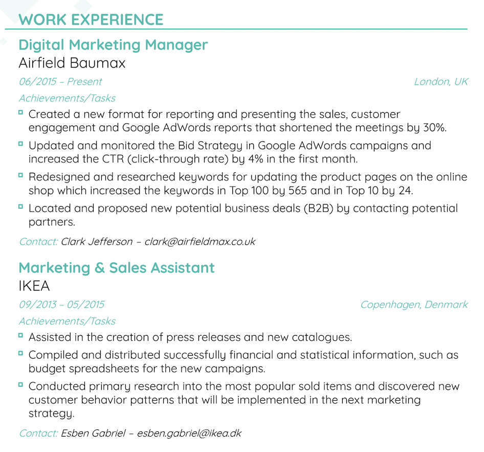
With that said though, there are some positions where you just can’t make a huge impact and you have to list your daily tasks instead. If that’s the case, don’t exaggerate and be straightforward within your responsibilities.
Skills
There are 2 types of skills: soft skills and hard skills.
Hard skills simply mean skills gained through any technical knowledge or training. They are often specific and essential for completing particular tasks (e.g. specific machine skills, tools, software, etc.)
Soft skills, meanwhile, refer to skills that can be gained from life experience and working with people (e.g. leadership, communication, adaptability, etc.).
Most job ads typically list what skills they’re looking for in candidates. So, be sure to tailor your skills section in your resume based on that.
Education
The education section is fairly straightforward, but can be easy to mess up as there are a few optional sections you can include.
Here’s what you should include:
- University name
- Program name
- Year attended
Here’s what you can include (optional):
- GPA - if it’s high (3.5+)
- Honors - if you have any noteworthy ones
- Academic achievements - again, if anything stands out
- Minor - if it’s relevant
Got it?
Now, here’s what that might look like:
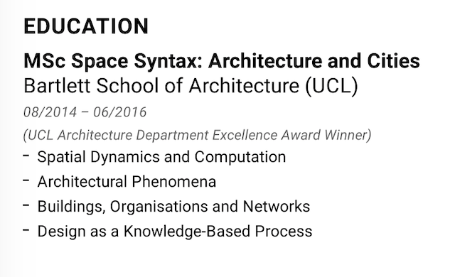
If you don’t have a lot of professional work experience, feel free to place your education on top of the work experience section.
Some of the other nice-to-have sections include:
- Hobbies and interests
- Volunteering Experience
- Projects
- Languages
- Certifications and Awards
- Publications
Key Takeaways
There is no such thing as the best resume layout.
There are a lot of things you can customize, and still leave an awesome impression. What counts, though, is whether the HR manager can read your resume at a glance.
If they were to look at your resume for 6 seconds would they be able to get a general idea of who you are and your experience?
If your resume is simple, follows a clear format, and is easy to scan through - then the answer is most likely - yes.
To recap, here’s what you should keep an eye on when working on your resume layout:
- Resume layout design: is everything consistent and does it give the reader enough space to breathe?
- Resume layout templates: is your resume going to be functional? Creative? Or simple? Use a resume template so that you don’t have to build everything from scratch
- Resume format: reverse-chronological if you have plenty of work experience and are not afraid to show it. Functional if that’s not the case and you prefer to let your skills shine, and finally, the hybrid format if you know what you’re doing and want to show off both.
- Content on a resume: include your contact information, resume summary or objective, work experience, skills, and education.
Now that you have the resume layout down, the job search continues.
After all, getting your resume layout right is only the first step. There’s a lot more to learn if you want to land that dream job.
So, check out our career blog for the latest advice on job search and keep learning!
Suggested readings:
